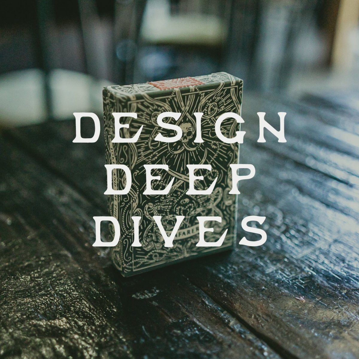
DESIGN DEEP DIVES: The Journey of Seafarers

DESIGN DEEP DIVE #1: The Seafarers' Journey!
In lieu of launching our newest deck of playing cards, Seafarers we thought we'd take you on a short journey through the processes that went into our latest design. This is a rare insight into design processes that people never usually get to see, so we're super excited to share!
Let's begin!
Gustavo was instrumental in bringing the Seafarers playing cards to life. Hailing from Brazil, he is a young designer with the most enthusiastic attitude we've ever seen when it came to illustration. He understood the vision for our nautical deck. This was classic vibe + that signature Joker and the Thief feel.
Let's take a peek into the design process.
THE BACKS
First step for us is the back design. We ALWAYS start with this, and we have a very good reason for it - the card backs tell us what the rest of the deck is going to look like. It sets the theme and feel, often letting us know which paths to take and not take early on. If you have a great back design right off the bat, it sets the standard of how everything else should look. From the Ace of Spades all the way to the tuck box.
We always build a story into our back designs. We do this primarily through symbolism. Each piece of imagery is thoroughly thought through.

THE ACE OF SPADES
From the back design we move onto the Ace of Spades. This probably the second most important part of the deck, as it really summates the feel of a deck of cards. It has to be iconic as well as tie into our brand imagery.

COLOUR EXPERIMENTATION
Playing with colours was important. For this project we experimented with various colour palettes and combinations. Although, in order to maintain a classic feel we had to look at what old United States Playing Card Company decks did. They primarily boasted monotone colour schemes, often only using 1 or 2 colours.
We did the same and decided to go for a Sea Green colour way inspired by a sample image we took in our hometown of Cairns on the Great Barrier Reef, in Australia. Here, the colour of the water goes from a rich estuarine green to a deep pelagic blue colour. We lifted and matched a Pantone to where the estuary meets the reef. Coupled with a beautiful muted, blood red colour and accented by a silver metallic ink, we ended up striking the balance between a classic design and our signature Joker and the Thief flair.
JOKERS AND COURTS
The Jokers are something that is symbolic and totally unique for Joker and the Thief. Instead of 2 Jokers we use 1 Joker cards and 1 Thief card.
The court cards all went through multiple variations. Each suit tells its own symbolic nautical story. Once we had the basic sketches of the courts, the versions appeared too clean. Adding the distressed, hand drawn feel to the courts really brought them to life and brought them in line with our brand.

THE TUCK BOX AND SEAL
Next up was the box and the seal. Right off the bat, we knew what we wanted for the seal. Tax Stamp Style - Gold Foil. Perforated. The reason we wanted to go with a gold foil seal was because of what we are doing with the tuck box. We took heavy inspiration from Dan and Dave Buck's Drifters playing cards. Starting with an off-white/cream paper stock, we will be using letter pressing to stamp Seafarers' signature green ink into the paper. Both on the inside and the outside of the box. The combination of an old school technique on the box and a touch of JT vibe was the perfect balance between vintage feel and branding.
Some other notable things about the box is its completely wraparound design. Each element is connected. There is also an intricately designed interior pattern for the tuck box adding a third dimension to the illustration and packaging.
Using a letterpress ink stamping process allows for the packaging to naturally patina with use, making each Seafarers deck unique to you and deeply personal. This does not mean it isn't durable. It certainly is. The tuck box is made to the highest possible standards in the industry.
The result of 6 months of designing is a deck that is not only beautiful and timeless in form, but understated and practical in function!
If you like what you see - You can pledge for your own SEAFARERS deck here!
Let's Set Sail with Seafarers!


Leave a comment